Reframing Search as Discovery
I reimagined the Zipcar search experience by rethinking the homepage search to support members who were still exploring, not just those ready to book.
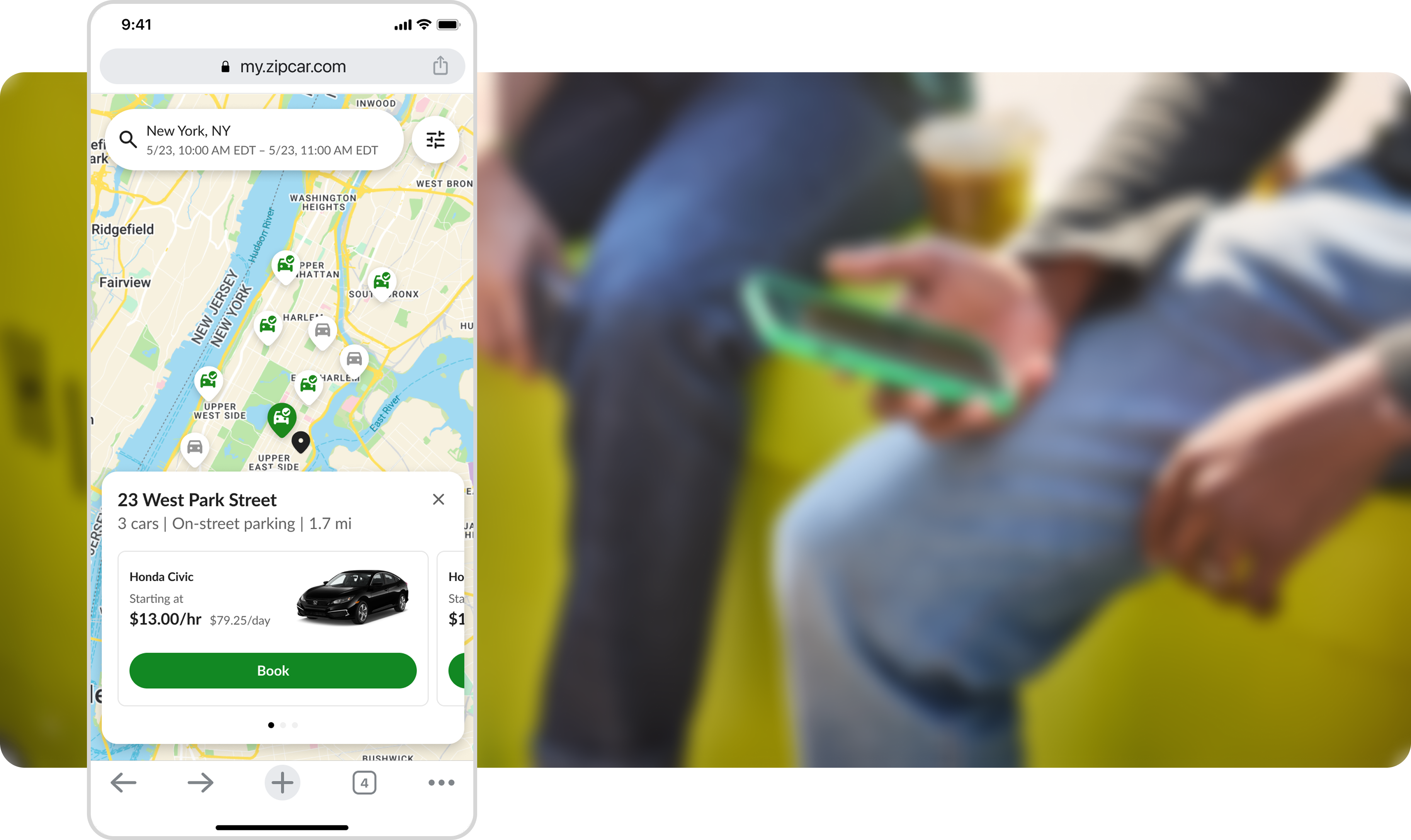
Outcomes
Concept validation with lasting impact
This project validated a more flexible search model for early-stage browsers, identified coverage display as a high-value product opportunity, and helped reframe search as more than a booking tool. While this project hasn't launched, those findings influenced future design exploration by significantly reducing the steps and thinking required to check if Zipcar was an option.
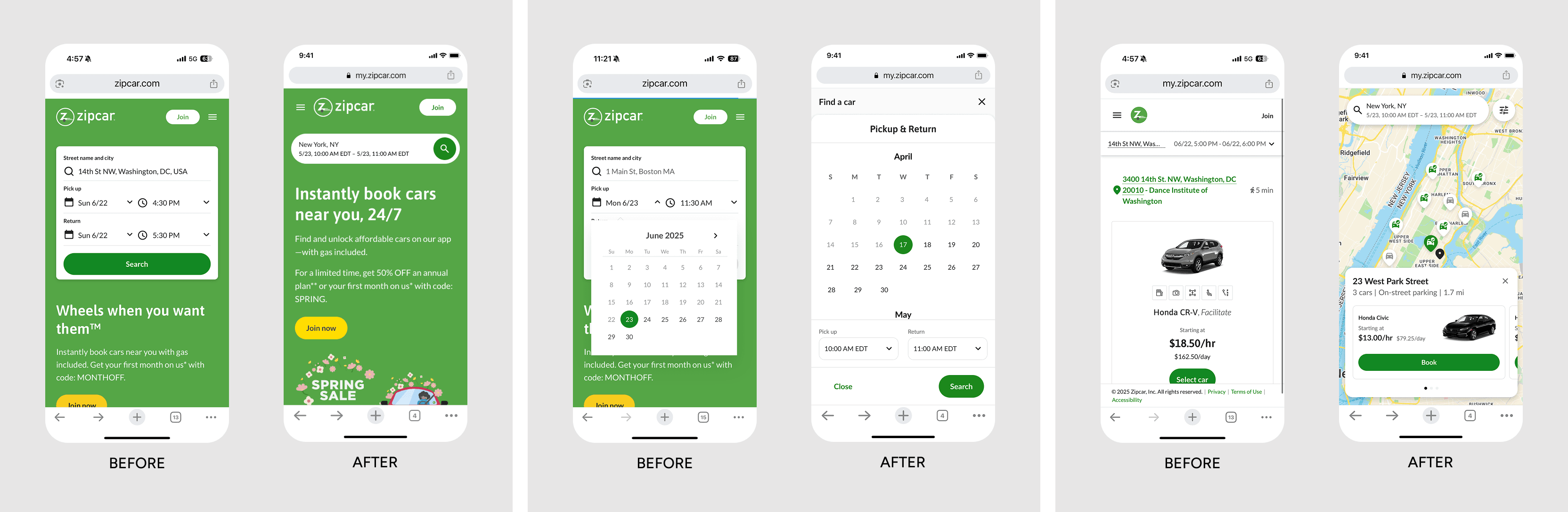
The updated search removes the biggest barriers to exploration by defaulting to location, consolidating trip inputs into one step, and replacing a cluttered results view with a map
The challenge
A flow built for committed bookers, not curious ones
Of 128,000+ homepage visitors over six months, only 30% tried a search — and just 12% finished one. The homepage was optimized for users ready to book, not users still evaluating whether Zipcar fit their lives and plans. Trip details were spread across four separate controls, demanding precision before users had a reason to commit. The experience offered little support for browsing broadly first, then narrowing with confidence.
128K+
homepage visitors over 6 months
30%
attempted a search
12%
completed all required inputs
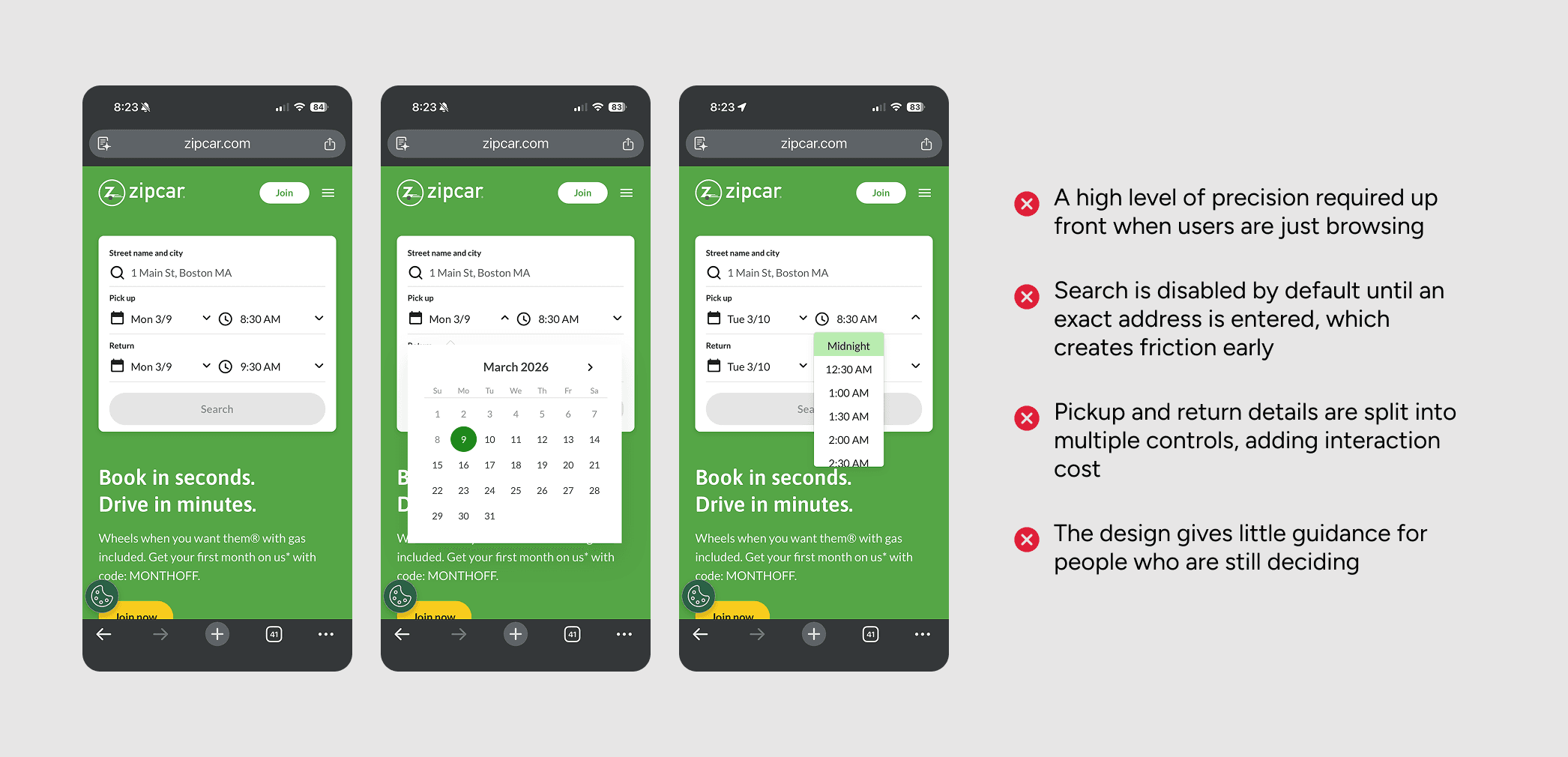
The original search experience from the home page
Approach
Broader location entry
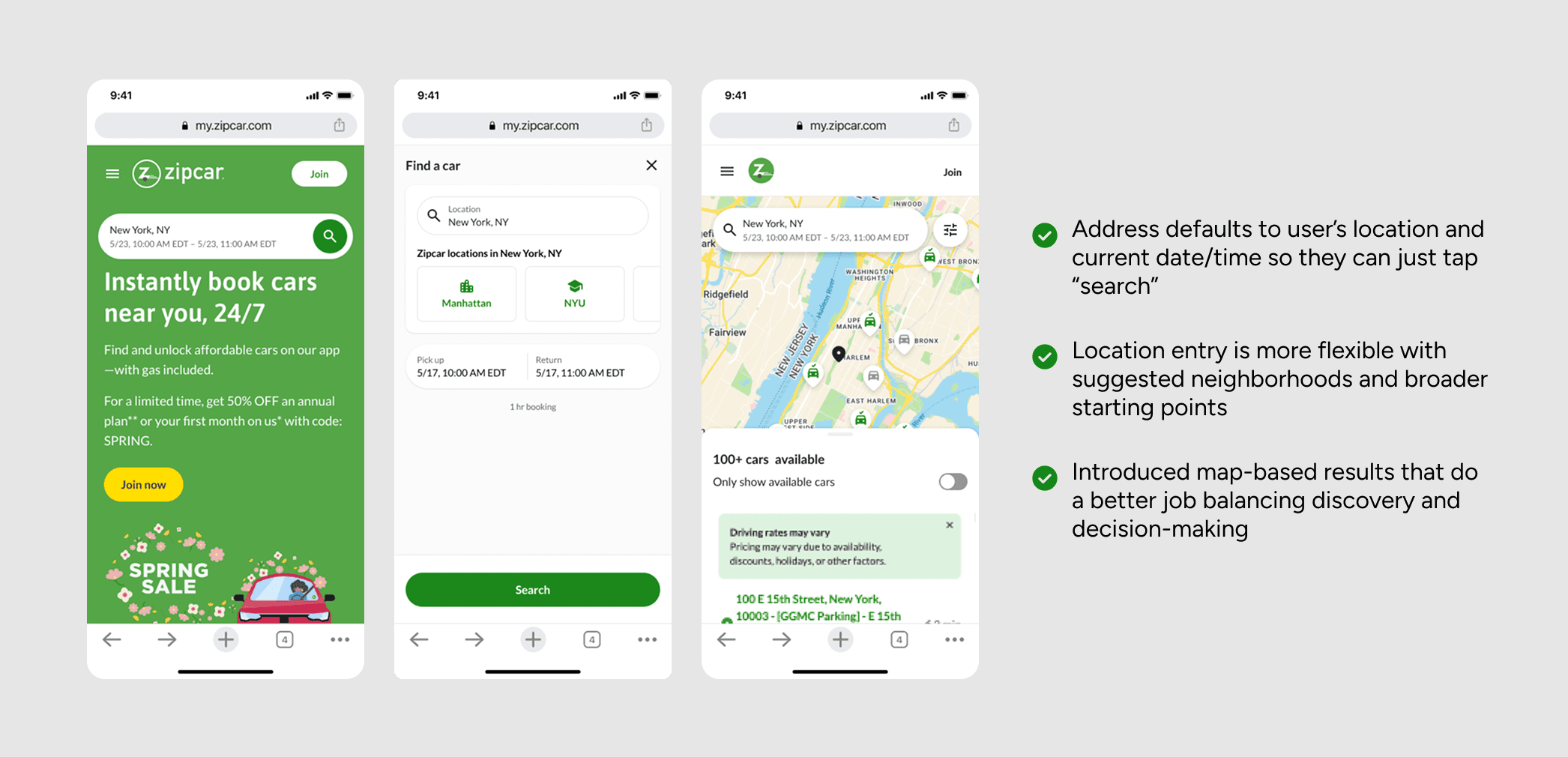
Users could now start with a market or neighborhood rather than a specific address. This answered the prior question first: does Zipcar even operate near me? Aligning with how exploratory users think lowered the barrier to starting.
Simplified trip inputs
Separate controls for location, date, and pickup/drop off times were consolidated into a single flow. I designed search to default to the user's geolocation so they could simply tap “search” to see what was nearby. Users could also set trip intent in one pass instead of piecing it together.
Coverage, not just availability
Results helped users understand where Zipcar operated broadly, not just what was available at one spot. Available and unavailable cars were visually differentiated, with a toggle to show broader service coverage. Giving prospects a realistic picture of Zipcar's footprint gave them a reason to keep going rather than bounce.
Informing Future Work
A case for search as discovery
The work helped clarify how Zipcar could better support people who were still exploring, not yet ready to book. Through concepting and testing, I showed that broadening location entry, simplifying trip setup, and surfacing results beyond exact availability could make search feel more approachable and informative for non-members.