Making EV Charging Feel Simple
I led the design of Zipcar's first EV charging experience, simplifying a complex physical and digital journey for members who may have never driven an EV before.

The challenge
58%
of members cited charging concerns when choosing gas over EVs
76%
of UK detractors mentioned charging-related issues
40%
of survey respondents had never been inside an EV
More than an app problem
An unfamiliar mental model
About 40% of members had never been inside an EV — and that group was five times more likely to feel uncomfortable renting one. We couldn't assume understanding of charging speed, connector types, range, or session duration.
A physical + digital journey
The experience started in the Zipcar app, but success depended on a real vehicle, a physical charging station, and third-party infrastructure. Members who tried to charge were already juggling Google Maps, PlugShare, and EVgo just to locate a session.
Third-party dependencies
Zipcar didn't control the charging network. Availability, compatibility, payment behavior, and charger status could all affect the experience.
Compatibility complexity
Different vehicles and chargers support different connector types. Rather than teaching members how to decipher that system, I wanted the product to make the right match for them.
Designing remotely for a UK service
I wasn't located in the market where the experience would launch, so I partnered closely with a UK-based teammate to ground design decisions in the realities of the local charging experience.
Approach
Scoping an ambiguous project
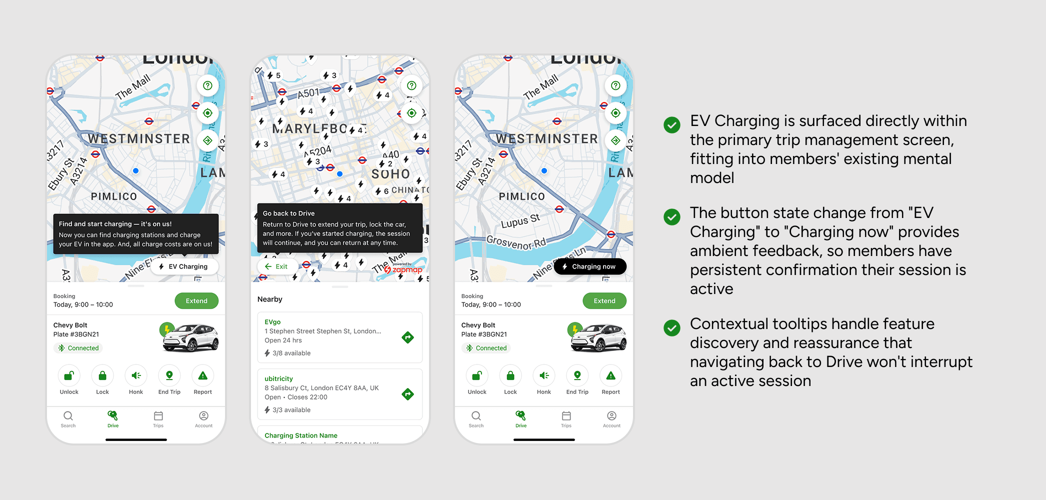
I scoped the MVP to a few key outcomes: help members confidently find and start a charging session, deliver just in time contextual education, and return to their trip without needing to babysit the screen.
Charging lives inside the trip
I integrated charging into the existing Drive screen (Drive is accessible while on-trip) so members wouldn't have to context-switch into a different part of the app. A persistent “Charging now” state provided ongoing reassurance without requiring a separate mode.
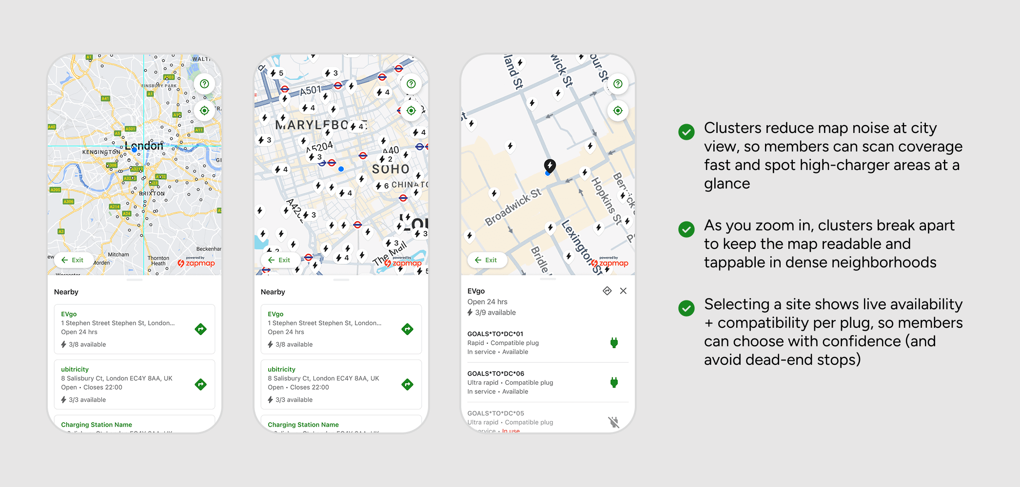
The system handles compatibility
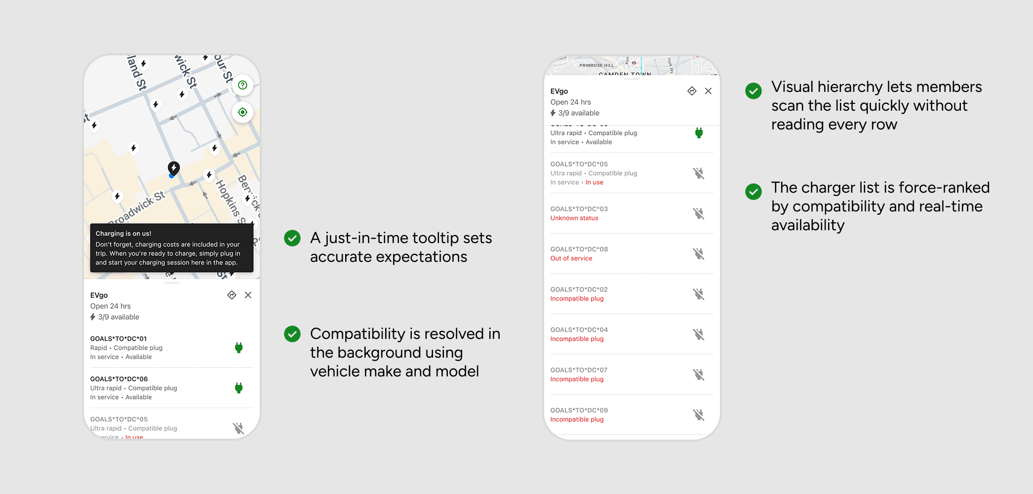
Rather than asking members to understand connector types, I designed the experience to show only chargers compatible with their vehicle. My guiding principle: if Zipcar knows the car, the product should know which chargers work with it.
“Charging is on us”
Research showed only about 50% of members expected charging costs to be included in their booking. Clear, persistent messaging that charging was covered by Zipcar appeared at every decision point where cost anxiety might cause hesitation — at charger initiation and at the Drive entry point.
Safety mechanisms
A charger code confirmation prevented wrong-unit mistakes at multi-charger stations. The session-stopping flow included education about locked plugs, addressing a mental model mismatch where 60% of usability study participants expected unplugging to end the session. The design supported both paths with just-in-time guidance.
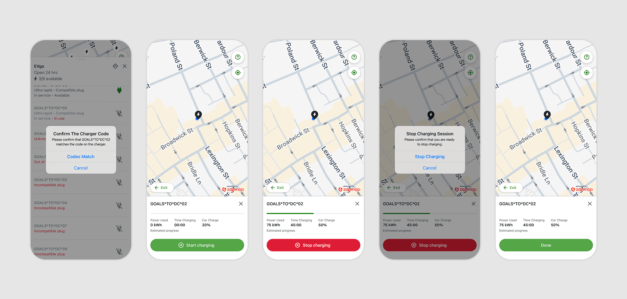
Charger confirmation reduces errors at the start, persistent session status keeps members informed while they’re away, and a clear stop flow ensures sessions end intentionally
Research & validation
76%
found the entry point immediately on first attempt
~75%
understood the charger code confirmation
86%
experienced navigation confusion — addressed through renaming and safe exits
Maze usability study, n=68
I ran a Maze study (US + UK, September 2023) before any engineering commitments — to test the core flow and surface problems while there was still room to address them. Because I didn’t have direct access to the UK charging network, I partnered with a UK teammate to document real-world charging flows end-to-end, bridging the gap between usability testing and actual conditions.
The study surfaced three problems: members didn’t know Zipcar covered charging costs, they weren’t confident their session would continue after navigating away, and the path back to the Drive screen was genuinely confusing. Those findings became the backbone of the MVP.