Design System Governance
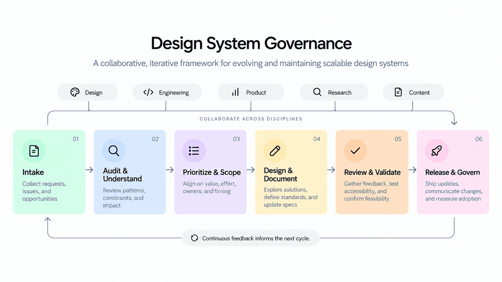
I created an end-to-end governance framework for design system component work, spanning research, design, build, release, and ongoing measurement.
See the FigJamRole
Design system lead
Platforms
Web, iOS, Android
Focus
Governance, research, accessibility, component architecture, documentation, QA
The challenge
Structure without ceremony
How might we create a repeatable process for evolving the design system while still giving teams room to move at the speed their work required?
The design system had grown over time, but the process around it was less mature. Component work could begin from different starting points, design and engineering weren't always involved at the same moments, and decisions weren't always shared, even on the design team.
That created a few risks: duplicated patterns, inconsistent behavior across surfaces, unclear ownership, and components that solved a local need without necessarily scaling to the rest of the product.
I wanted to create enough structure to improve quality and alignment without turning every component into a Project with a capital "P".
If I were designing this today
AI as a system accelerator
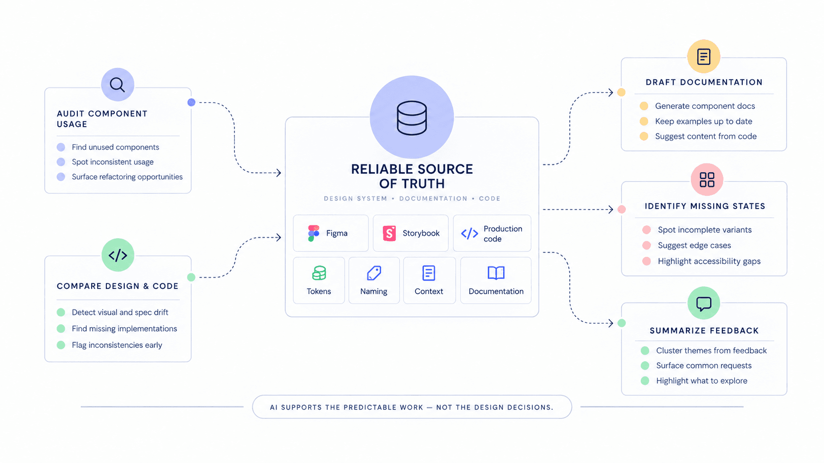
I'd keep the governance model, but I'd look for opportunities to use AI to reduce repetitive work and surface inconsistencies earlier. The most valuable applications wouldn't replace design decisions — they would accelerate the time-consuming parts and provide predictable structure: auditing component usage, comparing design and coded implementations, drafting documentation, identifying missing states, and summarizing feedback across reviews.
For that to work well, I'd first make sure the system had a reliable source of truth across Figma, Storybook, production code, tokens, naming, context, and documentation.
Start with the problem, not the component
The audit phase
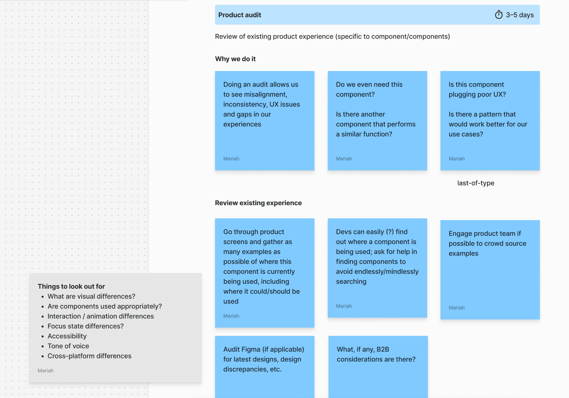
One of the most important decisions was to make the process begin with an audit rather than with design so we could understand how that component was being used.
The audit also forced us to ask harder questions:
- Do we actually need this component?
- Does another component already solve the same problem?
- Are we creating a reusable pattern, or patching over a deeper UX issue?
- What would this need to support across different platforms and use cases?
If I were running this audit today, I'd explore using AI to help inventory component usage across design and code, flag visual or structural inconsistencies, and surface likely duplicates. The designer's role would still be to interpret those findings and decide whether the system itself, or the underlying UX, needed to change.
Create shared context before design starts
Kickoff
I wanted to ensure we didn't create designs and toss them over the fence to engineering later. Instead, the team could align upfront on why the work mattered, what evidence we had, where the component would be used, what success looked like, and what technical or product constraints needed to be understood.
The group could change depending on the component. A web-specific component might need a smaller set of partners, while a shared component could involve web, mobile, and multiple engineering disciplines. This kept the process inclusive and nimble.
Research was baked in
Evidence before exploration
I wanted design-system decisions to be grounded in more than internal preference. The framework included a dedicated research phase covering external patterns, accessibility guidance, platform conventions, competitive examples, and best practices.
Research outputs could include:
- Examples and evaluation of other products and design systems
- Accessibility considerations
- Platform-specific conventions
- Naming and usage ideas
- Interaction and animation patterns
- Guidance for tone of voice and content
- Questions or dependencies to resolve before design
AI could make this phase faster by helping synthesize large sets of examples using tools like the Mobbin MCP, accessibility guidance, and platform conventions into themes or questions worth investigating.
Design for the system, not the happy path
Exploration
The design phase focused on confirming that components worked across real-world scenarios. The framework prompted designers to consider the full range of component behavior:
Use critique and testing where they add value
A decision tree for validation
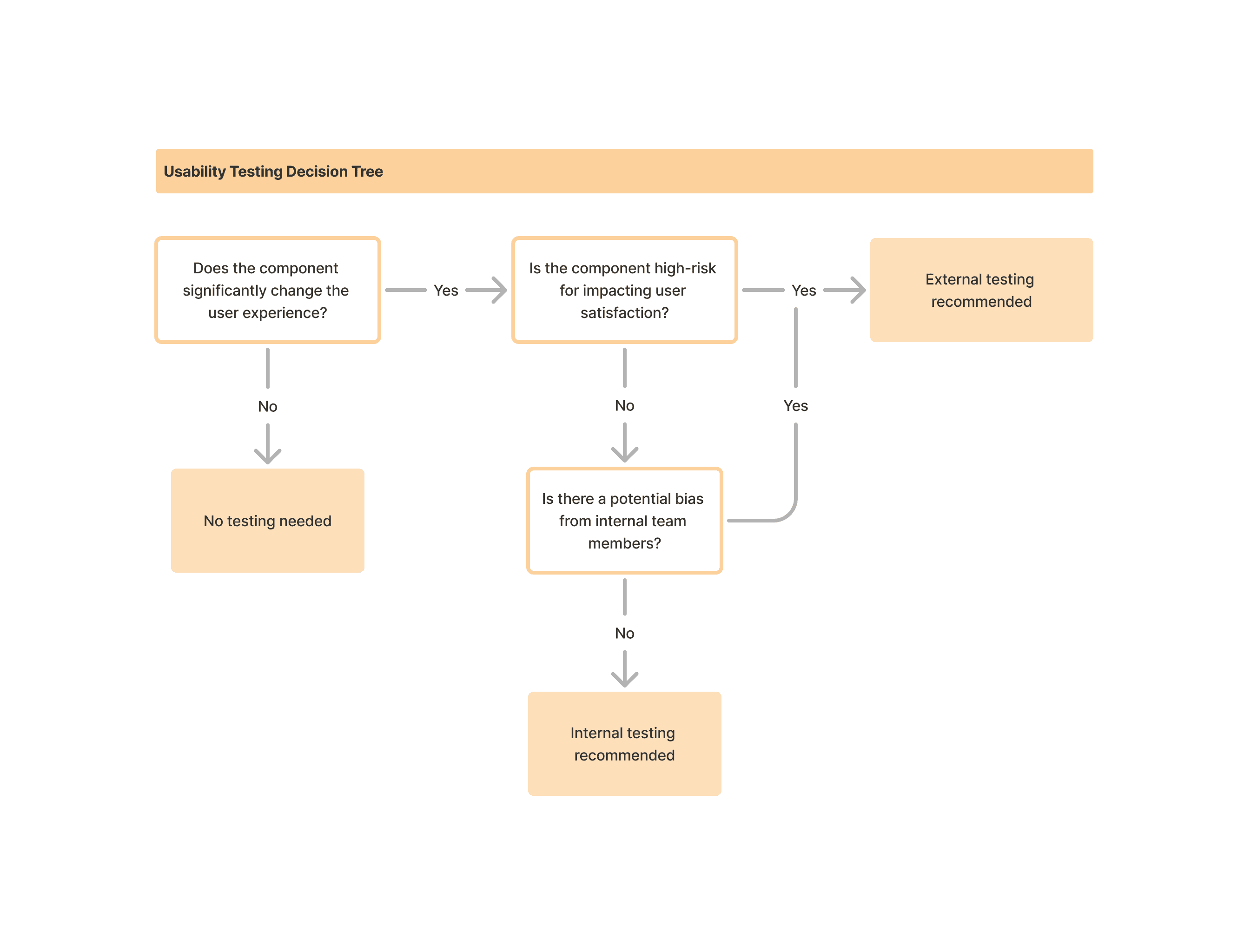
Not every component needs the same level of validation. I built flexibility into the governance model by defining when critique and usability testing were worth the time. Small changes could move more quickly, while components with bigger customer impact warranted deeper exploration and conversation.
I created a simple decision tree to help teams decide whether to test externally, internally, or not at all. The logic considered questions like:
- Does the component significantly change the user experience?
- Is there a meaningful risk to satisfaction or comprehension?
- Could internal feedback be biased?
- Is the change minor enough that testing would add little value?
That helped us avoid two extremes: skipping validation when it mattered, or slowing down low-risk work unnecessarily.
Align before building
Design alignment
Before a component moved into build, the team aligned on the proposed direction — the final component model, relevant permutations, prototypes, testing findings, and the rationale behind the design. We wanted shared confidence that the component was solving the right problem and could scale.
This also created a final opportunity to catch anything overlooked before implementation began.
Make the Figma component as usable as the product component
Figma build
I see the Figma build as a product for designers. The framework defined expectations for how components should be structured and exposed so they were easy to discover and hard to misuse. That included conventions for states, sizes, priority, status, platform and screen size, booleans, dynamic text, visible variants, and organized layers and pages.
If I were building this today, I'd also explore AI-assisted checks for missing states, inconsistent naming, token mismatches, or component structures that diverge from agreed standards to catch system debt before a component is published.
Specs explain how to build. Documentation explains how to use.
Two distinct artifacts
One distinction I wanted to make explicit was the difference between specifications and guidance. Specifications capture design intent: states, dimensions, behavior, tokens, interaction details, accessibility considerations, and the logic engineering needs to build correctly. Documentation explains how the component should be used in the product.
Documentation could include:
Handoff is a conversation
Spec walkthrough
Rather than sending a file and calling the work complete, the designer walked through the component, discussed open questions, and aligned on implementation and next steps with the engineers building it and the people who would rely on the documentation.
This was intentionally lightweight — keeping design and engineering connected through the build instead of treating implementation as a separate phase.
QA the system in the real product
Design QA
Once the component was built, design stayed involved. Whenever possible, the team reviewed the component in Storybook, staging, or another environment that reflected how it would actually behave in the product. The QA framework covered:
If design and code were sufficiently connected, AI-assisted QA could also help compare implementation against design specs and flag likely visual, state, token, or accessibility discrepancies for human review.
Treat release as part of governance
Release model
A component isn't useful if teams don't know it exists or understand what changed. I created a lightweight release model based on the size of the change — small updates might only need a short Slack post, while new components or meaningful changes could warrant a longer explanation, visual examples, a Loom, or a live walkthrough.
Release communication could include:
Measure whether the system is actually working
Ongoing measurement
A healthy design system should evolve based on how people actually use it, so I included both quantitative and qualitative signals in the governance model. These signals could help identify components that were difficult to use, being misapplied, or no longer serving the product well.
AI could help synthesize those signals over time — surfacing patterns like low-adoption components, repeated detachment, recurring support questions, or areas where teams consistently diverged from system guidance.
The outcome
A shared operating model
The framework created a shared operating model for how design-system work could move from discovery through release. It gave teams clearer expectations around research, ownership, cross-functional participation, critique, testing, component construction, engineering alignment, documentation, QA, release, and measurement.
More importantly, it changed the role of the design system from a library of reusable UI into an evolving product with its own process, standards, and feedback loops. The result was a stronger foundation for:
Explore the full process
FigJam working file
The portfolio version focuses on the major decisions and principles behind the governance model. The original FigJam includes the full working framework, including detailed activities, resources, facilitation guidance, testing criteria, documentation expectations, and release considerations.
See the FigJamWhat I learned
Process is the product
There is no perfect process—there are always trade offs and gray areas that will help us stretch and evolve the process over time. However, design-system quality depends as much on process as it does on components. Consistency doesn't come from a perfectly organized Figma library alone. It comes from shared context, clear ownership, strong design & engineering partnership, thoughtful documentation, and a process that helps teams make good decisions repeatedly.