Member Reporting
I led UX for Zipcar’s trip reporting redesign by simplifying a high-friction, business-critical flow into an experience that was easy for members to complete, and gave operations quality data.
Outcomes
$2.9M
in EBITDA from self-service reporting
81%
cleanliness attribution in year one
22%
decline in total accidents
The challenge
Competing interests
Member: “I had to stand on the side of the street in the rain holding all of my things and take pictures of the car.”
Operations: “We need reliable vehicle-condition data to attribute damage and cleanliness issues to specific trips.”
Business: “We need to increase the number and quality of reports to reduce operational costs and improve member experience.”
Member reporting was important to the business but painful for members. The existing flow had been repurposed from an older damage-reporting pattern and created friction at the wrong moments: during check-in, while members were still locating the car, dealing with unlock issues, or getting situated on a busy street.
Members described it as time-consuming, unintuitive, and sometimes unsafe. And without reliable attribution, operations teams couldn’t trace damage or cleanliness issues back to specific trips. The core tension was real: this was a business-needed action being handed to members, which meant it had to be genuinely easy to do or it simply wouldn’t get done well.
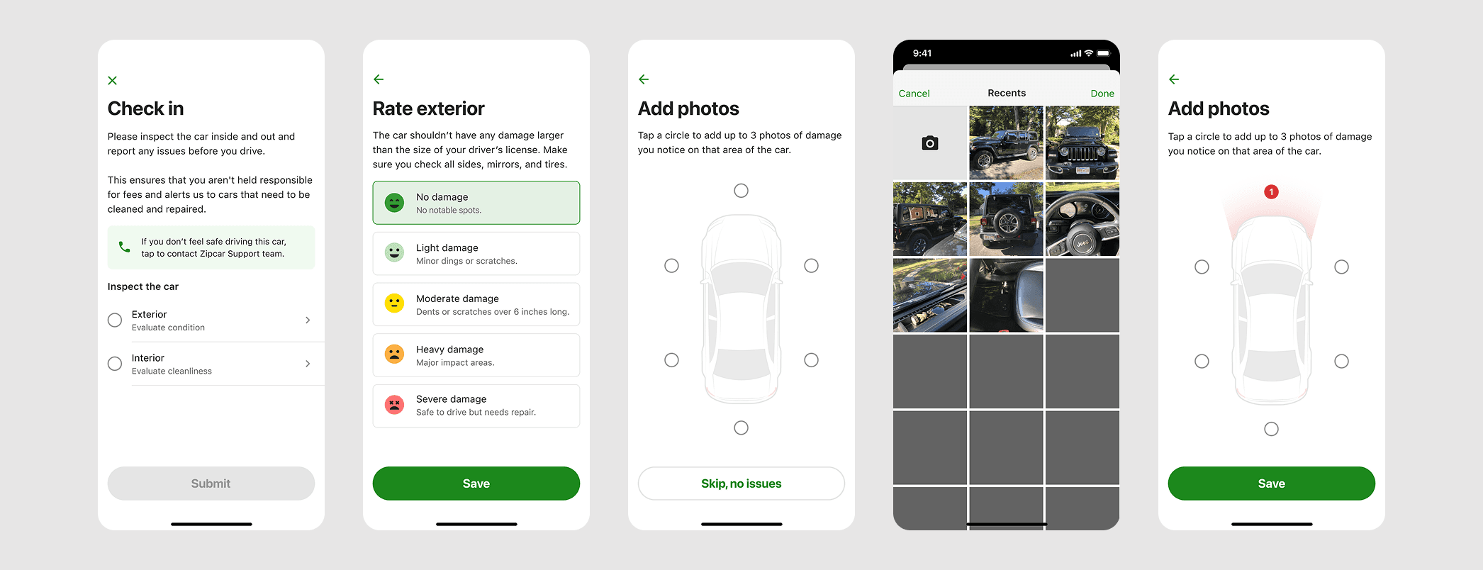
The old damage reporting pattern created a lot of friction at the start of a member’s trip
Approach
Starting with alignment
Before any design work started, I brought together product, UX research, and UX design for in-person workshops to align on what we were actually trying to solve. We landed on three principles that guided every decision: give members a moment to get in the car before asking them to do anything, and design for the reality that members often notice issues mid-trip, not just at check-in. Having those agreed on early made it much easier to resolve tradeoffs later without relitigating the whole problem.
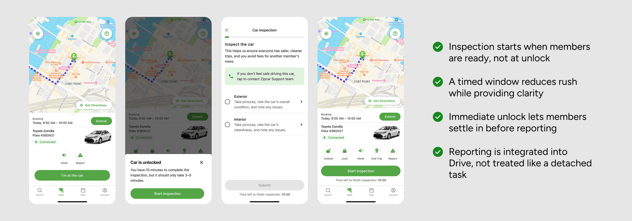
Decoupling inspection from unlock
I shifted inspection out of the check-in window by decoupling reporting from unlock, giving members a defined 10-minute window to do the inspection when they were ready. Members could also report issues after their trip had started. I knew from my own experience and member feedback that catching everything in the first few minutes of an unfamiliar car is challenging. Incremental save and partial submission logic made the flow more forgiving if members were interrupted or ran out of time.
A better photo experience
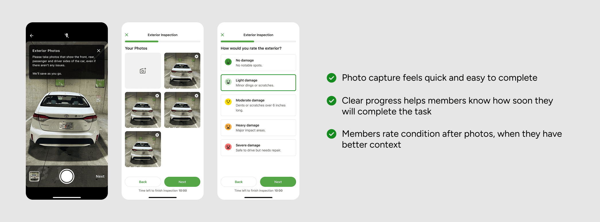
I redesigned photo capture around how members actually move around a car: they can photograph in whatever order makes sense rather than following a prescribed sequence. Forcing a fixed order added friction without adding value, which members didn't follow anyway, and made a quick check feel like a formal inspection. Condition rating was moved to after photo capture, so members could assess the car’s state with full visual context rather than from memory.
Fixing the Bluetooth moment
I worked with engineering on a small but consistently frustrating moment at trip start: the Bluetooth connectivity experience. Members were tapping the status chip and getting no feedback about what was happening in the background. I updated the interaction to show three clear states — Not in range, Connecting, and Connected.
What’s next
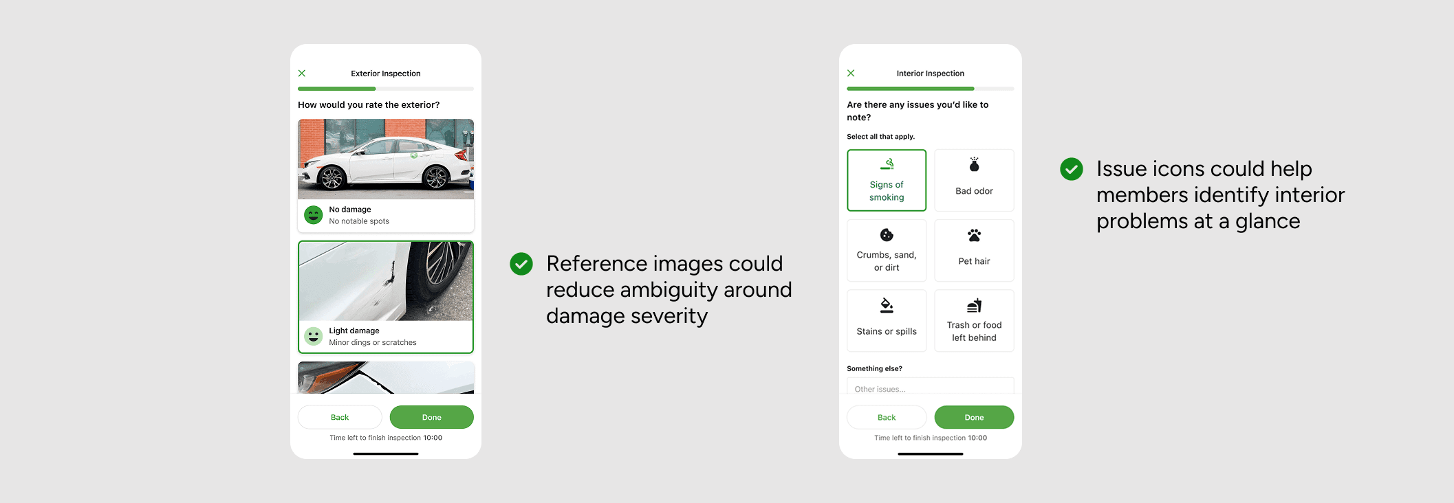
A more visual reporting model
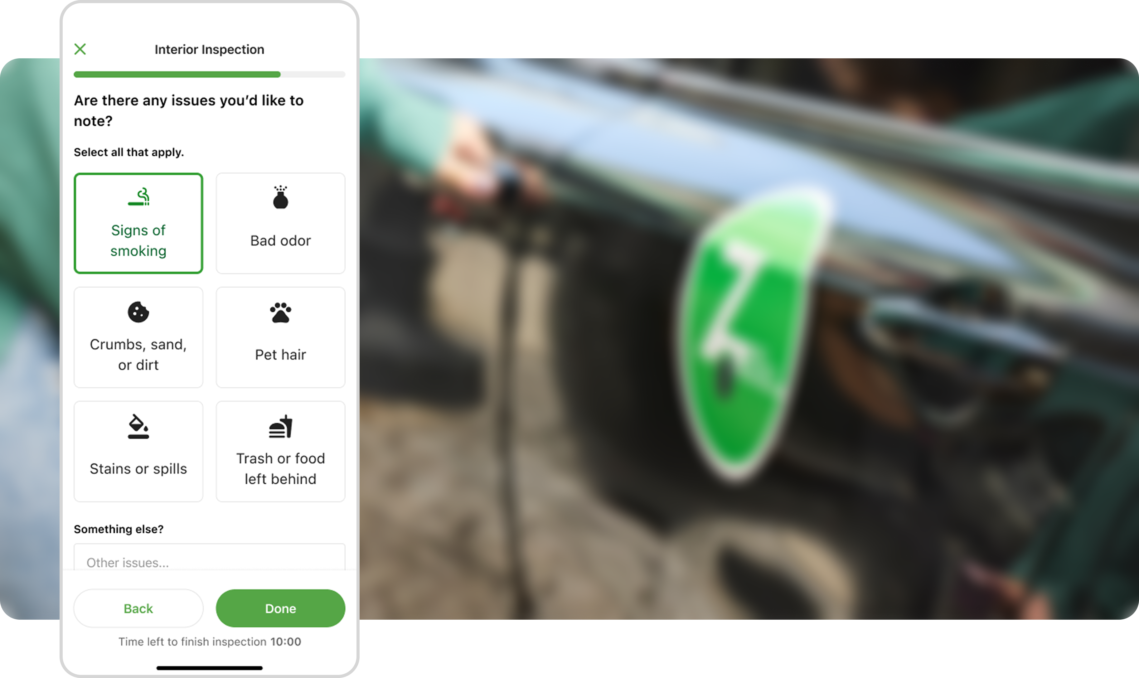
I explored a more visual approach to reporting for a later iteration. For damage, example images help reduce subjective interpretation and create better alignment around severity, making reports more consistent and easier to act on. For interior issues, a selection model helps members identify problems at a glance rather than working through text inputs.