Making EV Trips Easy for First-Time EV Drivers
I led UX for Zipcar’s first in-app EV charging flow in the UK, from finding a compatible charger to starting and stopping a session with contactless payment.
Overview
Project Snapshot
Role: UX Design Lead, Interaction Design, UX Writing, Research Planning, Facilitation
Timeline: Greenfield design MVP: 2024
Outcome: Validated and handed off; later deprioritized before launch.
Partners: Product, Engineering, UX Research, Fleet Operations, ZapMap (third-party partner), UK Market Team
About 40% of [survey] respondents have never been inside an EV and they are 5x more likely to feel uncomfortable renting one with us.
Early Signals
Charging wasn’t a niche usability issue. It was a booking barrier.
58%
of members cited charging concerns as their top reason for choosing a gas car over an EV
76%
of UK NPS detractors in "car readiness" were charging-related
40%
of survey respondents had never been inside an EV
Charging Friction
The opportunity was not just better support. It was unlocking EV consideration and reducing operational overhead at the same time. In the UK, charging issues dominated “car readiness” detractors, and the friction was suppressing EV bookings.
There was an ops upside too: moving charging support in-app reduced charge-card and reimbursement overhead, with an estimated $11K/year savings opportunity in the UK.
I scoped the MVP to one core outcome: help members confidently start a session, then get back to their trip without babysitting the screen.
Approach
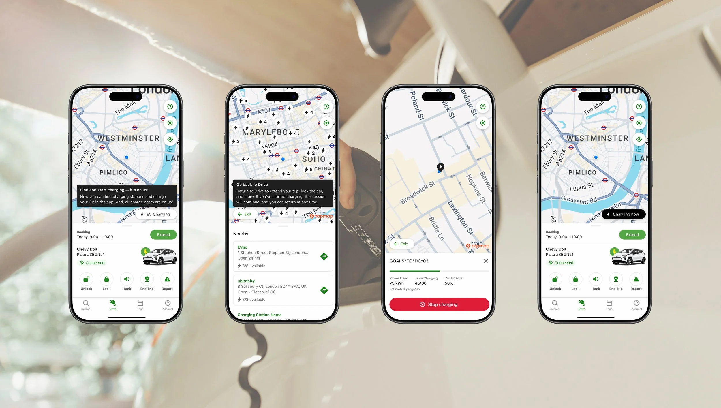
Staying Connected to the Trip
EV Charging lives inside the Drive screen so it fits the trip mental model. The state change to “Charging now” gives persistent confirmation without pulling members into a separate mode.
Testing showed a trust gap: people weren’t sure charging would continue if they left the screen. The tooltip solves that at the moment they’re most likely to back out, not in onboarding.
Finding Charging
I focused my approach on making charging feel like part of the trip: reduce decisions, reduce app switching. I also wanted to prevent the two most expensive failures: starting the wrong charger and stopping the session by accident.
At neighborhood zoom, members see charger pins with count. The list below surfaces what matters in the moment: network, address, hours, and real-time availability.
Compatibility Without Cognitive Overload
Most members don’t know plug standards, and they shouldn’t have to. Compatibility is resolved in the background using vehicle data, so only workable chargers show up.
Only compatible chargers surface by default
Results are ranked by compatibility and real-time availability
Status is scannable at a glance through icon + hierarchy
A just-in-time tooltip clarifies “charging is on us” before members commit
Starting and Stopping a Session
This flow is designed for first-timers and built to prevent costly mistakes. A charger code confirmation reduces “wrong unit” errors at multi-charger stations. The live sheet shows time, power, and charge level so members always know it’s working. Stopping is protected with clear education about the locked plug and a confirmation step to prevent accidental termination.
Research and Iteration
Prototype validation: Maze usability study (n=68, US + UK), Sept 2023. We tested the full path from finding a charger to ending a session, with a focus on discoverability, trust, and navigation safety.
Key learnings:
Navigation risk: 86% misclicked trying to get back to Drive. I renamed the toggle, added a “Go back to Drive” helper, and added a safe exit path inside the stop flow.
Cost trust gap: only ~50% expected Zipcar to cover charging. I added “Charging is on us” at initiation + Drive discovery.
Mental model mismatch: 60% expected unplugging to end the session. I supported both paths and added just-in-time education about the locked plug.
Discoverability: 76% found entry point on first click. I kept Drive entry, added first-time intro tooltip.
Charger confirmation: ~75% understood the code confirmation. I reinforced at selection and flagged for real-world verification post-launch.
Challenges
Designing From a Distance
Because I couldn’t test the live UK network directly, I created a lightweight field-research partnership with a UK teammate to close the realism gap. They documented the real-world flow end to end, and those notes became inputs alongside usability data and partner constraints.
Where This Led
Informing Future Work
Although this work didn’t ship, it helped define a clearer path forward. We validated the concept with 68 members, surfaced the biggest usability risks before build, and delivered a build-ready interaction model that de-risked both partner integration and future EV capabilities.
The value carried into broader product thinking too. Lessons around payment clarity, trust, and map scanning informed other in-app experiences, and the ZapMap work created a reusable pattern for integrating third-party data into Zipcar while keeping the experience in-app.