Reducing Search Friction
I redesigned Zipcar’s homepage search to make it easier for new users to explore cars nearby, even when they didn’t know the exact address or time.
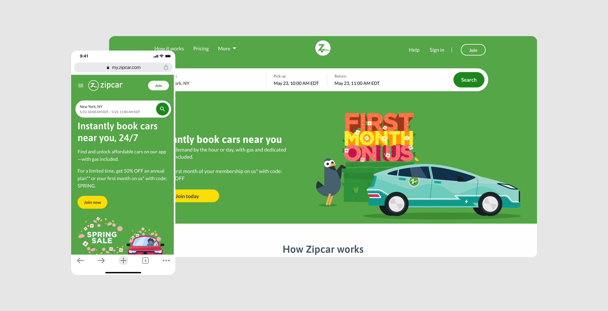
Overview
Project Snapshot
Role: UX Design Lead, Interaction Design, Prototyping, UX Writing, Usability Testing
Timeline: 12 weeks
Partners: Product, Engineering, Marketing, Analytics
Problems to Solve
The homepage was optimized for users ready to book, not users still evaluating whether Zipcar fit their lives. Over a six-month period, more than 128K people visited the homepage, but only 30% attempted a search and just 12% completed the required inputs. This meant we were losing potential members before they ever saw meaningful inventory.
The homepage search required too much precision too early, which created friction for people who were still exploring.
The flow was optimized for users with a fixed plan, not for visitors trying to quickly understand whether Zipcar would work for them.
Key trip details were spread across several controls, making setup feel heavier than it needed to.
The experience offered little support for browsing broadly first, then narrowing with confidence.
I worked on a more flexible search experience that made browsing feel easier and more intuitive. Instead of forcing perfect inputs, the new experience let people start with broader signals like market, neighborhood, and flexible trip details so they could understand availability faster and with less effort.
My Approach
Broader Location Entry
Starting at the market or neighborhood level let people answer the bigger question first: does Zipcar operate where I need it? That gave people a faster starting point and better matched how they were actually thinking at this stage.
Simplified Trip Inputs
I removed the need to manage four separate controls up front, so users could set trip intent in one pass instead of piecing it together. Time selection stayed flexible, but the overall setup felt more cohesive and less fragmented.
Showing Coverage, Not Just Availability
The results experience helped users understand not just what was available right now, but where Zipcar operated more broadly. Available and unavailable cars were visually differentiated, and users could toggle to only show available cars when they wanted a cleaner booking view. That helped reduce the “Zipcar must not be here” false negative that the original experience was creating.
Challenges
Limited Scope
I intentionally focused scope on the parts of the journey most likely to improve search initiation and exploration. Search results card redesigns were worthwhile, but secondary to reducing early abandonment. Those card improvements were deferred to adjacent work.
I kept scope focused on reducing search friction, even though other downstream UI issues also needed work.
The redesign had to work within existing card and results patterns rather than rebuilding the full experience.
Outcome
Informing Future Work
Although Flexible Search did not launch, the work helped clarify how Zipcar could better support people who were still exploring, not yet ready to book. Through concepting and testing, I showed that broadening location entry, simplifying trip setup, and surfacing results beyond exact availability could make search feel more approachable and informative for non-members.
The project also helped reframe search as more than a booking tool. It surfaced a larger product opportunity: helping people quickly understand whether Zipcar fits their needs, where it operates, and what kinds of cars might be available before asking them to commit to precise trip details.
What this work contributed:
Validated a more flexible search model for early-stage browsers
Identified friction points in the existing search experience before development
Demonstrated the value of showing location coverage, not just exact-match availability
Helped inform future thinking around member and non-member search experiences
Even without launch, the project created useful clarity around where search was creating unnecessary drop-off, and what a more exploratory, confidence-building experience could look like.