Turning Loyalty Into Revenue
I led UX for Zipcar’s first Rewards experience across the app, web, and member services—turning a long-anticipated member request into a program that drove +2.47% monthly revenue and an 81% redemption rate within 6 months of launch.
Driving Real Business Impact
+2.47%
Revenue per month
$4.6M
Annualized EBITDA
81%
Reward redemption rate
In 6 months, Rewards proved both member demand and business viability.
Overview
Project Snapshot
My Role: UX Design, Facilitation, Interaction Design, UX Writing, Animation, Research
Partners: Product, Research, Engineering, Marketing, Leadership
Timeline: MVP: 6 months; Iteration and support: ongoing
Member research, support themes, and app store reviews consistently surfaced the same gap: Zipcar had no way to recognize loyal, positive community behavior. Rewards was built to increase trip frequency, reduce churn, and give members a reason to keep choosing Zipcar.
As the lead designer on a net-new loyalty program built from scratch, my role spanned early program shaping through post-launch measurement. I ran unmoderated research studies, facilitated cross-functional workshops across product, marketing, engineering, and finance, and mined post-launch data to surface signals on engagement, redemption, and churn.
I helped define both the member experience and the underlying rules that made the program scalable across channels, markets, and future segments.
“With Rewards, I would choose Zipcar over other [transportation] options since I know I’d earn [rewards].”
— Resonance study participantEarly Signals: Resonance Testing
To de-risk Rewards early, UX Research ran resonance testing with test Rewards announcement emails as stimuli before we invested in UI. The results gave us early confidence that the MVP would land (avg excitement ~3.9/5), while also validating where we’d need to level-up over time (the “V3” concept scored even higher at ~4.4/5).
Those signals directly shaped early design decisions. I prioritized a simple, easy-to-track Rewards model, flexible redemption, challenges, and prominent access in the app.
This gave us permission to keep the MVP simple while protecting space for later expansion.
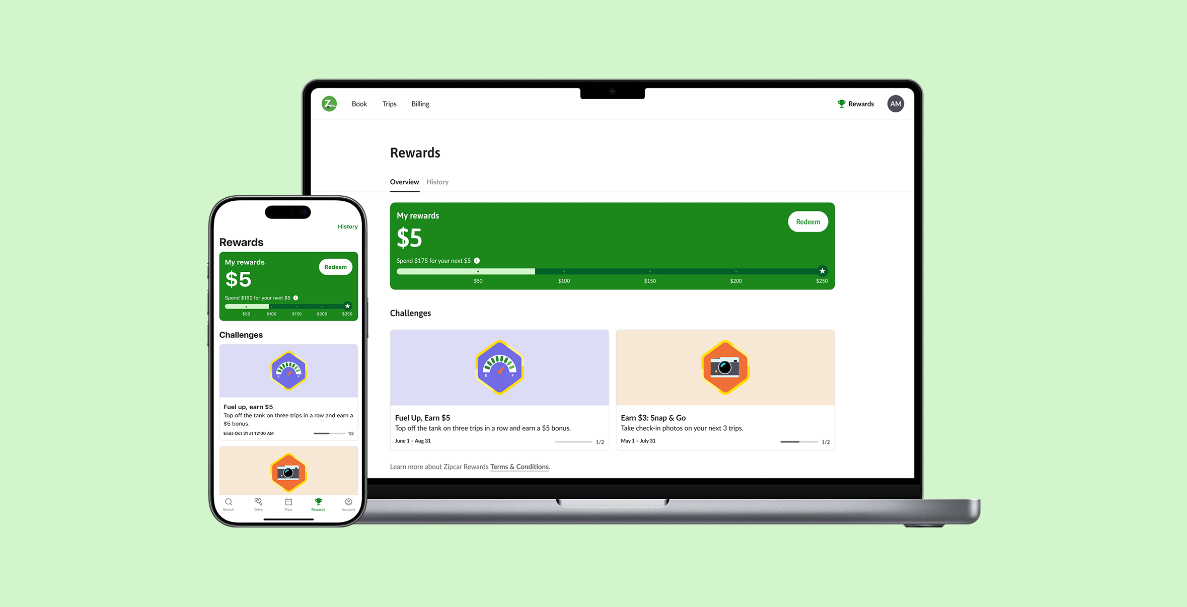
Designing for Comprehension and Motivation
Every design decision was grounded in research. Members needed to answer two questions instantly: What do I have? and How close am I? Research showed those were the moments that drove motivation, so the hierarchy was built around them.
By making balance and next milestone instantly legible, the experience increased motivation to return and reduced the risk that Rewards would feel too abstract to matter.
Kept upcoming trip progress separate from the tracker after testing showed combining them created confusion, not momentum.
Added intentional friction to the redemption flow—once redeemed, rewards convert to a 30-day coupon. Protecting that window was critical given that redeemed rewards are associated with $130–175 in usage revenue per trip.
Incremental progress markers were retained after research confirmed they meaningfully supported motivation and perceived progress.
Defining a Rules System Across Member and Agent Tools
Designing Rewards for mobile, web, and internal member services tools meant solving for very different platforms while still delivering a cohesive, end-to-end experience. I had to align a wide range of stakeholders and ensure the agent tooling reflected the same rules, language, and mental models as the member-facing experience. This required constant collaboration and careful orchestration so that what members saw and what agents used to support them stayed tightly in sync.
My Approach
Design Sprints
I used design sprints to align product, engineering, marketing, and member services on the program model. These sprints were pivotal in shaping the Rewards experience. We established a collective mental model around Rewards, defined what’s important for the business and members, pushed us to define requirements for the MVP, and how we could grow the program.
In the first design sprint, we defined early requirements (later verified by research):
Rewards math should be easy to understand
Leverage Rewards to encourage good community behavior
Let members choose when to redeem their rewards (ability to save up)
Ensure Rewards are earned quickly
Aligned on behavior to incentivize
Clarified MVP vs future phases
Ongoing Research
A continuous research cadence including resonance interviews, Maze prototype tests, and post-launch moderated sessions, kept us from shipping assumptions. Post-launch studies surfaced rage-clicking and comprehension gaps in the progress tracker. We used those findings to tighten hierarchy, cues, and education before they became retention risks.
Iterative Design
I iterated quickly based on what research and early member behavior told us was confusing.
I pushed to include Rewards in the primary navigation instead of hidden away in the Account tab to support future growth and fold in Promotions for a more central, long-term thinking, and cohesive experience.
I refined the reward tracker to make progress and redeemable value easier to understand at a glance.
Added in-the-moment feedback (like lightweight education when “Redeem” wasn’t available) to reduce guesswork and mis-taps.
I navigated a shift from points to dollars, updating the UI and language so the program still felt simple, trackable, and consistent across the experience.
Project Challenges
Points-to-Dollars Pivot
Mid-stream, accounting required a fundamental shift from a points model to a dollar-based system for balance sheet compliance. This wasn't a copy change—it required rebuilding the program's core mental model. I led focused design sprints to align Product, Engineering, and Research around a single, intuitive rule: $1 spent = $1 toward Rewards. Unmoderated research validated the new model before handoff, keeping the timeline intact."
Balancing Promos + Rewards
One of the core challenges was introducing Rewards into an existing Promotions ecosystem without breaking trust, logic, or platform consistency. Promotions were already an important lever for short-term revenue spikes, so I had to ensure the new Rewards model could coexist with existing promo behavior in a way that felt seamless to both the business and the member. To members, a promo and a reward are not meaningfully different. They simply expect savings to work clearly and predictably.
In the process, I uncovered inconsistent error handling across iOS, Android, and web. I streamlined the card design and messaging to account for the full range of promo and reward scenarios, and helped create a more unified experience across platforms.
“You get that little ‘Yay’ when you reach a milestone... you just want to congratulate yourself.”
Zipcar’s First Rewards Program
There was no playbook. I designed the experience while simultaneously defining the underlying rules, logic, and edge cases from scratch—decisions that will govern the program for years. That meant every choice had to hold up not just for launch, but for the account types, markets, and iterations that would follow.
What’s Next
Rewards launched to consumer members and is already delivering measurable business impact. The next phase expands the program to University and Uber business segments—using the same core architecture, making expansion low-effort and high-confidence. Planned iterations include smarter progress visualization, milestone animations, and just-in-time education informed by what post-launch research taught us about where members lose momentum.
This project taught me that loyalty design is less about perks and more about building a rules system members can trust.